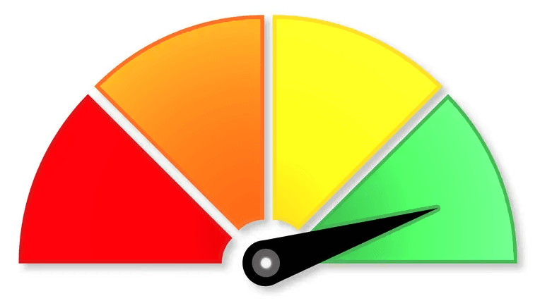
SESEME value
Science, Elective, Sports, English, Math.
This is a value or a pyramid graph of the school’s layout to show in which areas the school is strong and in which the school is small in size.
- What defines the school’s image: sports or mathematics, science, academics, music, diversity, etc.?
- How well does the school perform in each area relative to the other areas?
What is fact vs. fiction? Has the school’s image changed? Should it? What needs to be promoted? A school might have a small STEM area, but it might perform much better than other areas. Is it all relative, depending on how people look at the data? Is that the image the administration wants or is their a strong, positive, growing educational institution they want to promote? What data do they need to promote, grow and support the desired image?
- How good is attendance?
- How consistent is the turning in of student assignments in the LMS?

Observing a school’s values in a picture format graph, instantly shows how the school operates.
This was inspired by very good friend of mine who travelled for a principal’s position interview in a beautiful part of the country.
When he returned, he said with disappointment that they wanted him to be the principal, but he turned it down. I asked the obvious question, why? His reply inspired the development of this picture graph.
He said that on arriving he realized it was a sports focused school, and he is an academic oriented principal. He informed the school’s administration it would not be a good fit for the school or him. He declined the position.
This inspired us to develop this visual picture presentation of a school’s focus or functioning. If my friend had asked for this picture graph, he would have been able to better see if he was a right fit for the school. The school would have received better applicants as well.
This can become the standard for schools, as a picture graph shows it all at a glance. Will some school’s not like what they see? Reality is a good place to start building a better reality.


